Fintech · Fuel Management · Mobile App · Product Design
Tango Corporate Lite
Designing a streamlined fuel payment experience that gives corporate users greater control, visibility, and accountability over everyday transactions.
- Role
- Product Designer
- Timeline
- 3 weeks
- Platform
- Corporate mobile app
- Team
- Cross-functional Product team
- Industry
- HR Tech · Corporate Management
Overview
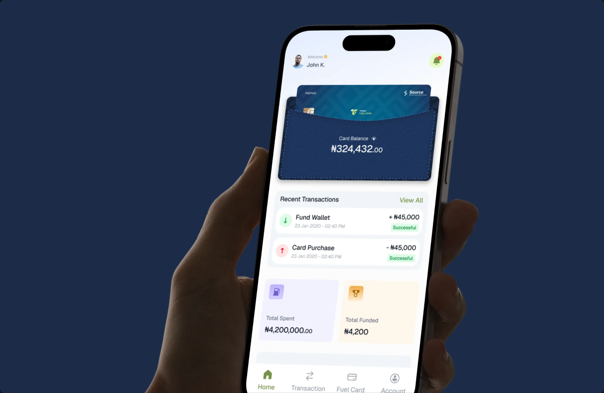
Tango Corporate Lite is a mobile fuel-management application designed for corporate users to manage fuel-related payments and transaction records from their phones. The experience brings together account visibility, fuel payments, beneficiary management, transaction tracking, and proof-of-payment submission into one controlled workflow.
The problem
Making a fuel payment involves more than transferring money. Users need to identify the correct recipient, enter transaction details, verify the payment, and provide evidence of the fuel purchase. The challenge was to create a straightforward experience around these requirements while maintaining the level of accountability expected from a corporate payment system.
The proof-of-payment requirement added another layer to the experience. Users need to upload evidence after completing a transfer, while repeated failure to provide evidence can eventually disable the Pay by Transfer feature.
The Solution
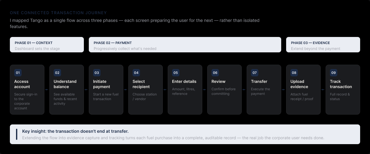
I approached Tango as a connected transaction journey rather than a collection of individual screens. The core experience was structured around:
Access account → Understand balance → Initiate payment → Select recipient → Enter details → Review → Transfer → Upload evidence → Track transaction
This helped establish a clear relationship between each part of the product. The dashboard provides the context users need before taking action, while the payment flow progressively collects the information required to complete a transaction. The evidence flow then extends the transaction beyond the payment itself, creating a complete record of the fuel purchase.
Key product decisions
01
Make the dashboard action-oriented
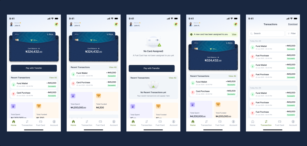
The home dashboard prioritises the information users are most likely to need immediately: account/vehicle information, available balance, recent activity, and Pay by Transfer status. Rather than making users navigate through multiple sections before taking action, the primary payment action and other frequently used tasks are surfaced directly on the dashboard.
02
Break the payment journey into focused steps
The Pay by Transfer experience was structured progressively:
Recipient → Amount & Notes → Review → Confirmation
This keeps each step focused while giving users an opportunity to verify important information before completing the transaction. The flow supports both entering a new recipient and selecting an existing beneficiary, reducing repetitive data entry for returning users.
03
Make proof submission part of the transaction
Proof of payment was treated as a core part of the experience rather than an additional administrative task. Users can take a photo or choose an existing image, preview it, verify the required information, retake or reselect it, and then upload the evidence. This creates a more connected journey from payment to verification.
04
Communicate consequences clearly
Because missing evidence can result in restrictions to Pay by Transfer, the interface needs to communicate consequences without creating unnecessary confusion. The experience therefore uses transaction states, warnings, reminders, and clear next actions to help users understand what is required and how to resolve the issue.
Final experience
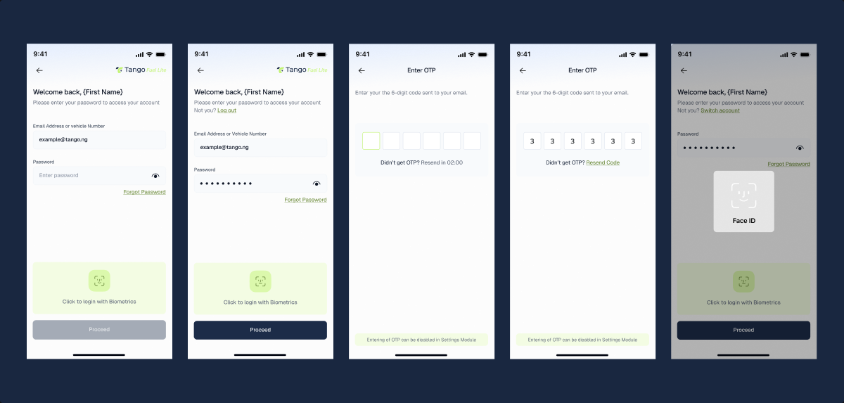
The final experience brings the core fuel-payment journey into one mobile product. Users can securely access their account, understand their available balance, initiate fuel payments, manage beneficiaries, review transactions, and submit payment evidence without switching between separate systems.
The experience is built around a simple principle: Make every required step clear, while keeping the overall transaction journey straightforward.
Design system
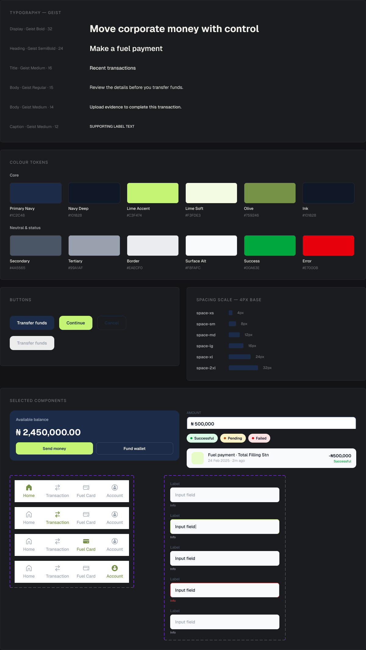
The interface was built around a consistent set of reusable components and states across the product. This included buttons and CTAs, form fields, account and transaction cards, transaction status indicators, beneficiary components, upload and image-preview components, navigation, loading states, validation states, and success and error feedback.
Consistency was particularly important across the payment and evidence flows, where users need clear feedback at every stage.
NEXT PROJECT
Polio Landing Page →