SaaS · Landing Page · Self-Initiated Practice · UI/UX Design
Polio Landing Page
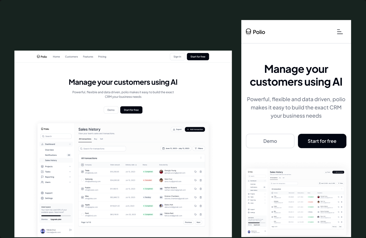
A self-initiated CRM landing page designed to showcase my approach to SaaS product design.
- Role
- UI/UX Designer
- Timeline
- 1 Week
- Platform
- Responsive web
Overview
Polio is a self-initiated landing page concept I designed while developing my product and visual design skills.
The goal wasn't to launch a real product or website, but to challenge myself to design a complete SaaS marketing experience from scratch, from defining the page structure and messaging hierarchy to designing responsive layouts across desktop, tablet, and mobile.
I treated the exercise like a real product brief: starting with a fictional CRM product and thinking through how its landing page could communicate value, build credibility, explain features, and ultimately encourage users to start a trial.
The problem
The challenge was simple:
How do I design a SaaS landing page that communicates a product's value quickly without overwhelming the visitor?
Because this was a self-initiated project, there was no existing product, user research, or established brand system to work from.
That meant I had to make the design decisions myself, including:
- What information should appear first?
- How should the product's value be communicated?
- What sections would help build trust?
- How should a complex CRM product be represented visually?
- Where should calls-to-action appear?
- How should the experience adapt across different screen sizes?
Rather than designing individual sections in isolation, I approached the page as a complete conversion journey.
The Solution
Before designing the interface, I broke down the landing page into the questions a potential customer would naturally have.
- What is this? → Hero
- What does it help me do? → Product capabilities
- Why should I trust it? → Customer logos and testimonials
- What does the product actually look like? → Product screenshots and feature demonstrations
- Can it work with my existing tools? → Integrations
- Is it worth trying? → Free-trial CTAs
- What if I still have questions? → FAQ
This gave me a simple narrative:
Introduce → Explain → Demonstrate → Validate → Reassure → Convert
That became the foundation for the entire page.
Key product decisions
01
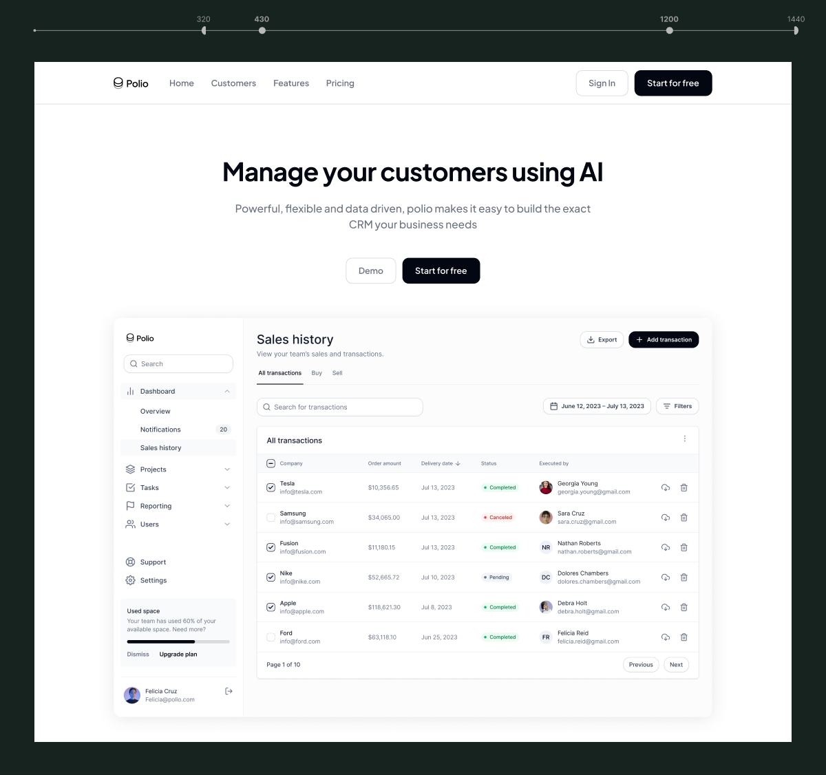
Lead with the product's value
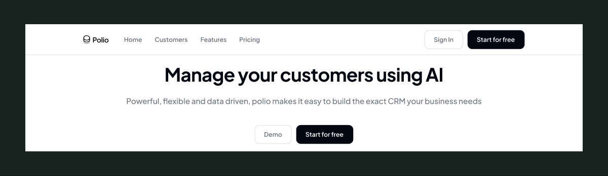
The first thing I wanted visitors to understand wasn't a list of features, but what the product helps them accomplish. So I used Manage your customers using AI, followed by supporting copy that gives additional context. The product interface is then immediately visible beneath the messaging.
My thinking
For a SaaS product, the visitor should be able to understand three things almost immediately:
What is it? → What does it do? → What does it look like?
Putting the product UI directly within the hero helps answer the third question without requiring the visitor to scroll.
02
Use product UI to explain the product
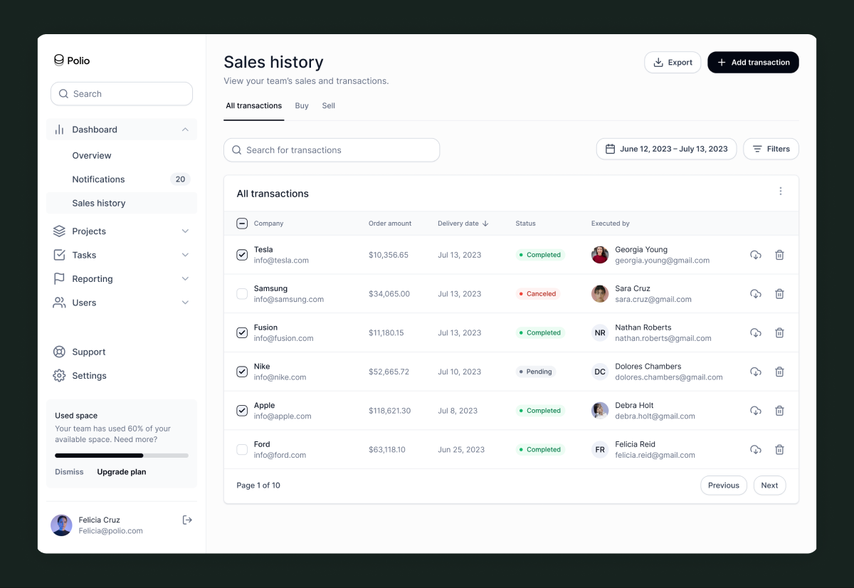
Instead of relying entirely on marketing copy, I used interface previews throughout the page.
The hero shows the CRM dashboard, while later sections introduce different product capabilities through UI examples.
My thinking
A CRM can be difficult to explain through text alone.
Showing the actual interface allows the visitor to understand the product through visual evidence rather than reading a long feature description.
This also helped the landing page feel more like a representation of an actual product rather than a purely marketing-driven website.
03
Build trust progressively
After introducing the product, I introduced recognizable companies such as Amazon, Coca-Cola, FedEx, Nike, and Walmart. The intention was to create a visual trust signal before moving into the detailed feature explanation.
My thinking
The page follows a deliberate sequence:
Value → Credibility → Features
Instead of asking users to immediately trust the product, the design gradually reinforces confidence as they scroll.

04
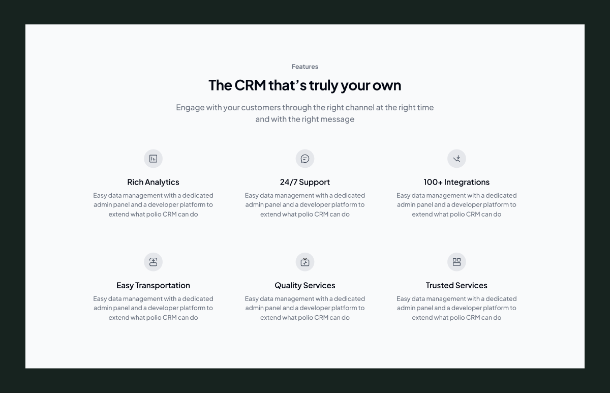
Turn features into benefits
The feature section isn't presented as a long technical specification. Instead, capabilities such as:
- Rich Analytics
- 24/7 Support
- 100+ Integrations
- Easy Importation
- Quality Services
- Intuitive Services
are presented as concise benefits.
My thinking
I wanted to avoid making the visitor work to understand the product.
Each feature should answer: “Why should I care?” rather than simply: “What functionality exists?”
05
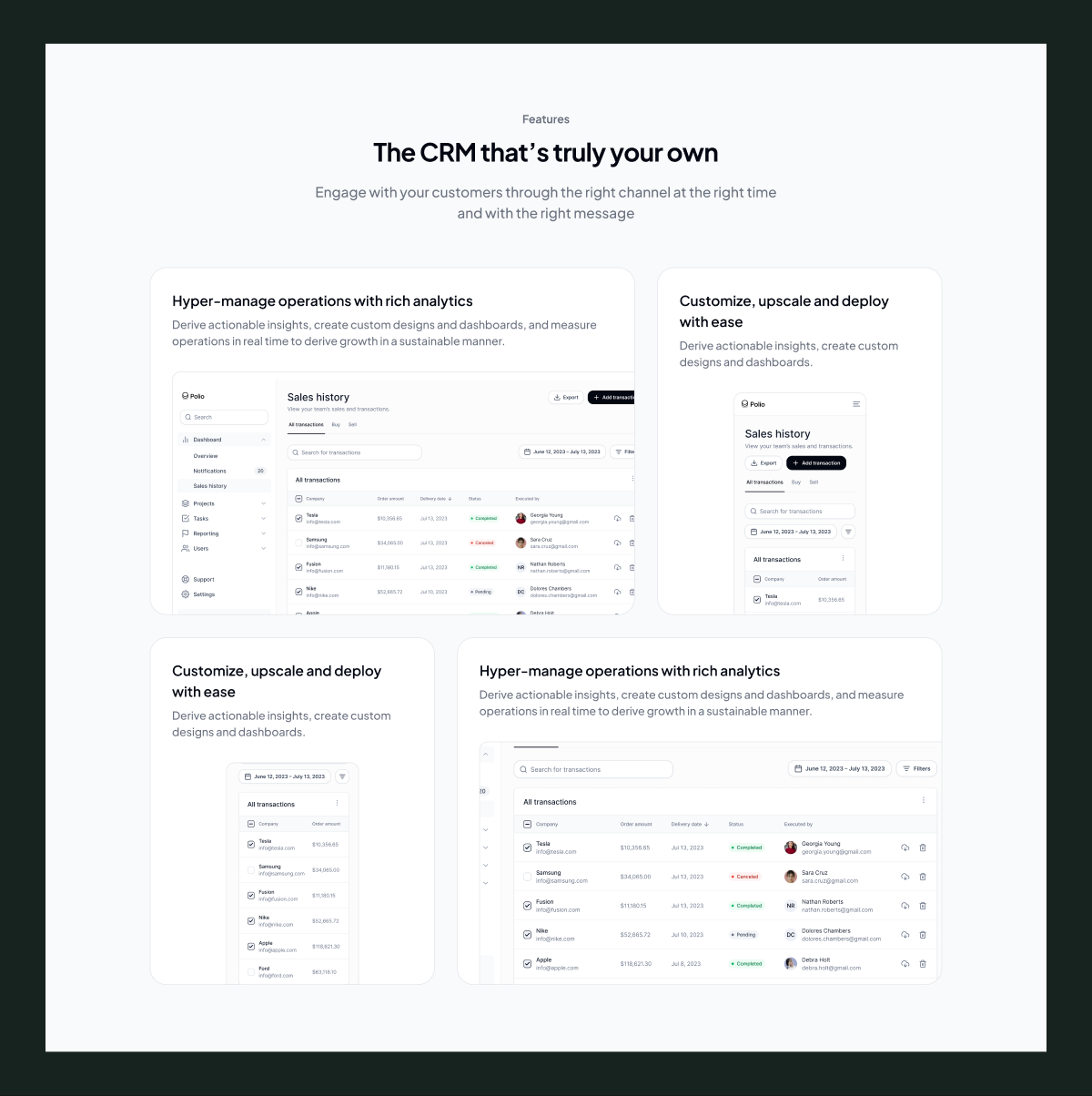
Show the product in context
Further down the page, I introduced larger product screenshots alongside specific use cases.
For example, the interface is paired with messaging around hyper-managing operations with rich analytics and customizing the experience.
My thinking
This section moves from telling to showing.
The earlier feature section establishes what the product offers. The product previews then demonstrate what using those capabilities could look like.
06
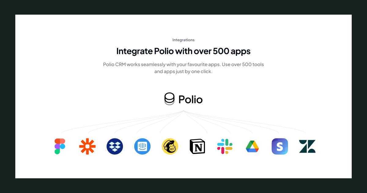
Use integrations to remove adoption friction
The integrations section introduces Polio alongside other tools and platforms.
My thinking
For a CRM product, integration capability can influence whether a potential customer sees the product as practical for their existing workflow.
So instead of positioning Polio as something users have to completely reorganize their workflow around, the section communicates: “This can work alongside the tools you already use.”
07
Finish with reassurance and conversion
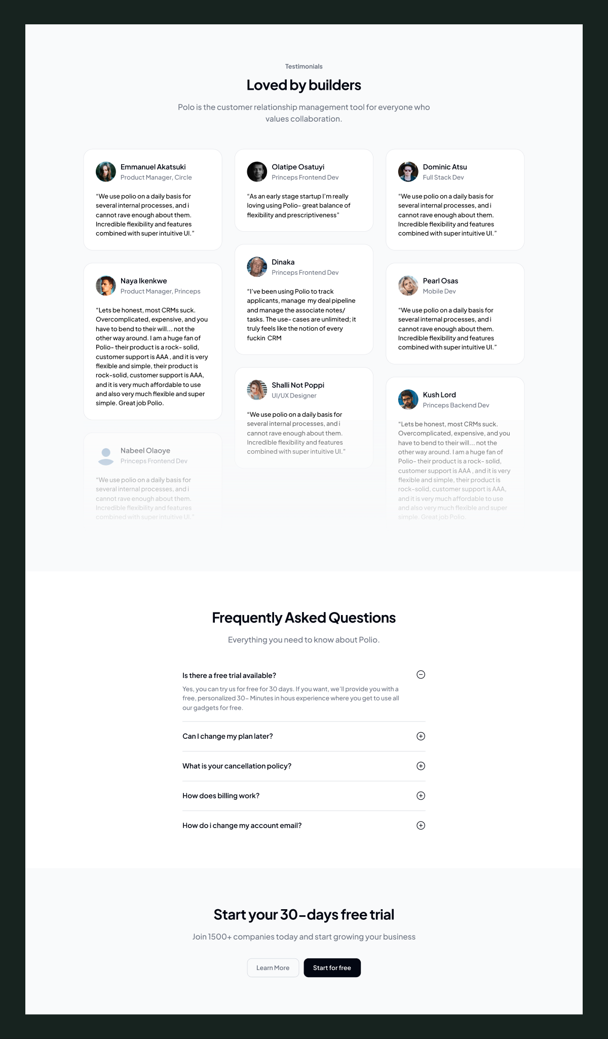
The lower sections use testimonials, FAQs, and repeated trial CTAs.
My thinking
By this point, the visitor has already seen:
The product → Features → Integrations → Social proof
The remaining job is to remove uncertainty.
That's why the page closes with:
Testimonials → FAQ → Free trial CTA
rather than introducing another major product feature.
Final experience
The final landing page was designed as a long-form SaaS marketing experience that gradually moves visitors from understanding the product to considering action.
The overall structure became:
Hero → Social Proof → Features → Product Showcase → Integrations → Testimonials → FAQ → CTA
Each section has a specific role in the overall narrative rather than simply filling space on the page.
The repeated “Start your 30-days free trial” CTA also gives users multiple opportunities to act without forcing them to return to the top of the page.
Break points
The landing page was designed responsively across desktop, tablet, and mobile breakpoints, adapting layouts, spacing, typography, and content hierarchy to each screen size rather than simply scaling the desktop layout down.
Desktop
Designed around the full-width experience, using multi-column layouts, larger product showcases, generous spacing, and wider content sections to maximise visual storytelling.
Tablet
Layouts were restructured to work within a reduced canvas, adjusting column widths, spacing, and element positioning while preserving the original content hierarchy.
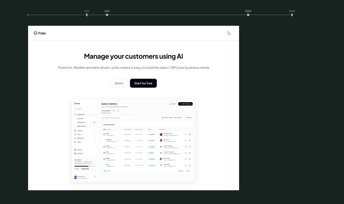
Mobile
The experience shifts to a single-column layout with simplified navigation, scaled typography, resized product previews, and accessible CTAs. Content was prioritised to ensure the core message and product experience remain clear on smaller screens.
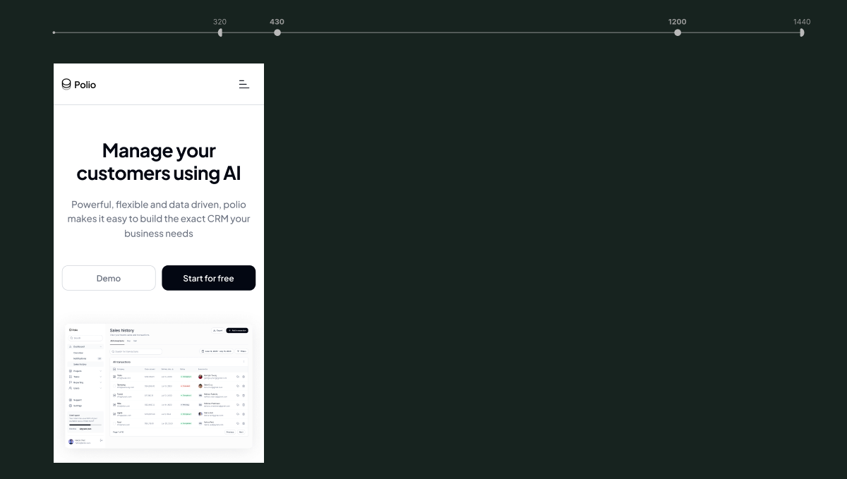
The goal across all three breakpoints was to maintain the same product story and visual hierarchy while allowing the layout to naturally adapt to the user's device.
NEXT PROJECT
Admin dashboard revamp →