Fintech · B2B SaaS · Admin Platform
Girostack Admin Portal
A redesigned financial operations platform built to give teams clearer visibility and control over payment activity.
- Role
- Product Designer
- Timeline
- 4 Weeks
- Platform
- Web
- Team
- Cross-functional Product team
- Industry
- Fintech · Payment Infrastructure
Overview
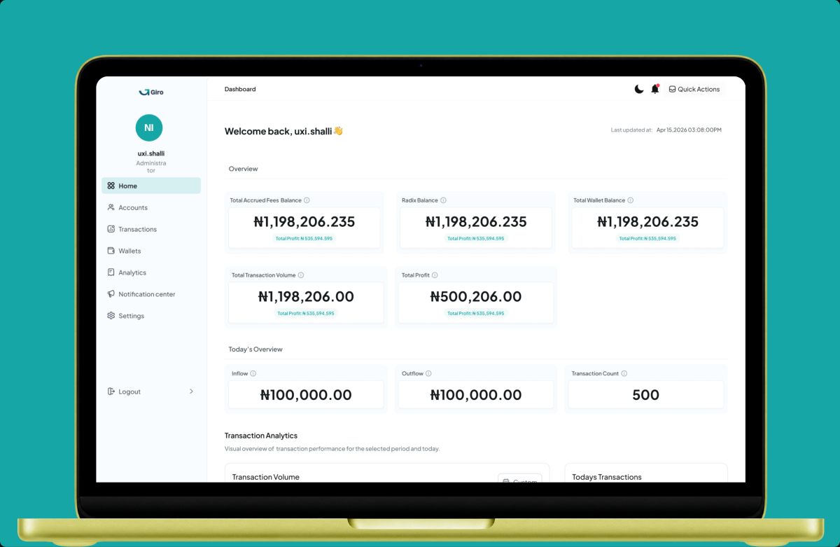
Girostack Admin Portal is a central operations platform for managing businesses, wallets, transactions, disbursements, analytics, reports, alerts, and platform configurations. The redesign focused on helping operations and finance teams move through complex financial workflows with greater clarity, from monitoring platform health to investigating transactions and managing sensitive actions.
The problem
As Girostack's financial operations grow, the amount of information admins need to monitor grows with it. The challenge wasn't simply displaying more data. Admins needed to quickly understand what was happening across the platform, locate specific records, investigate issues, and take actions such as refunds, reversals, wallet operations, and batch approvals. The existing experience needed a stronger structure for visibility, investigation, and control across these workflows.
The Solution
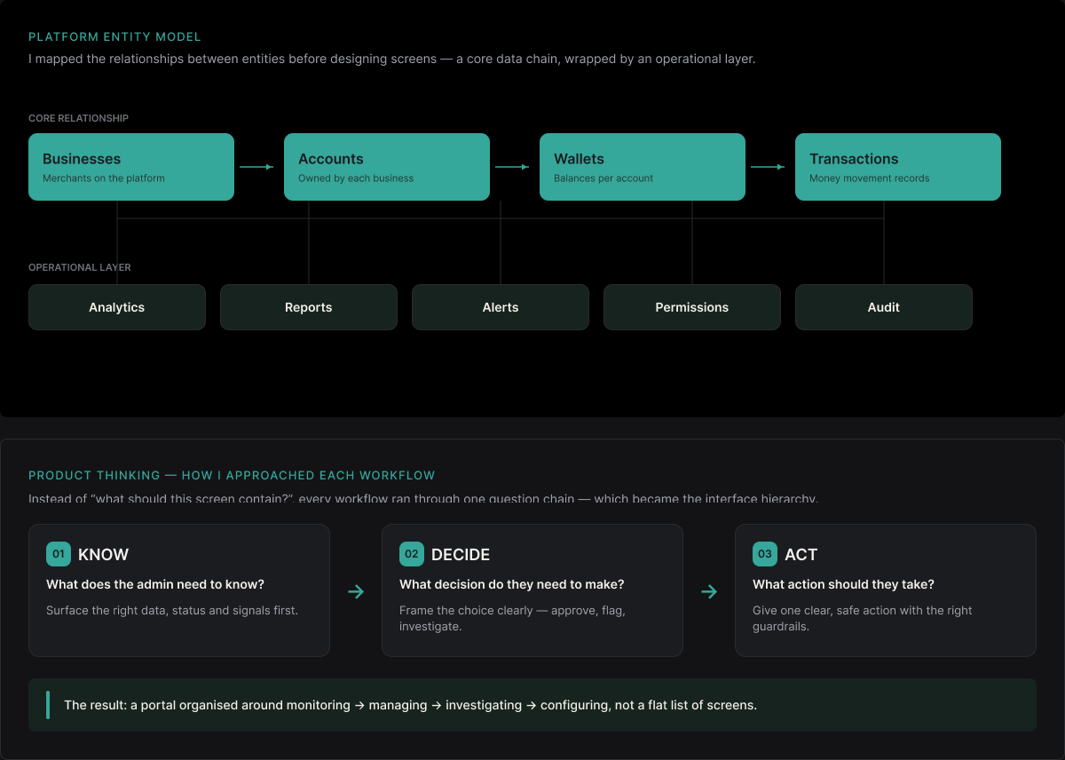
I started by mapping the relationship between the major entities in the platform rather than treating each feature as an isolated screen. The core relationship became:
Businesses → Accounts → Wallets → Transactions
Around this sits the operational layer:
Analytics → Reports → Alerts → Permissions → Audit
This helped shape the information architecture and gave the portal a clearer hierarchy between monitoring the platform, managing records, investigating issues, and configuring the system.
Product thinking
Rather than asking “What should this screen contain?”, I approached each workflow through: What does the admin need to know? → What decision do they need to make? → What action should they be able to take? That became the foundation for the interface hierarchy.
Key product decisions
01
Lead with platform health
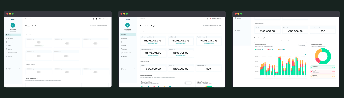
The dashboard was designed to answer the most important question first: “How is the platform performing right now?” Instead of presenting isolated statistics, I brought together balances, revenue, transaction activity, success/failure rates, pending transactions, system health and active customers. Quick actions then allow admins to move directly from monitoring into tasks such as searching, viewing alerts, pending approvals, or downloading statements.
02
Design for investigation, not just visibility
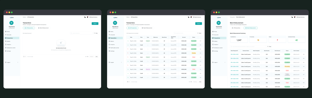
Financial admins don't only need to see transactions, they need to understand why something happened and what they can do about it. The transaction experience therefore moves from: Find → Understand → Investigate → Act. Filters make large transaction volumes easier to navigate, while the transaction detail view brings together the timeline, source, destination, fees, webhook status, related transactions and available actions.
03
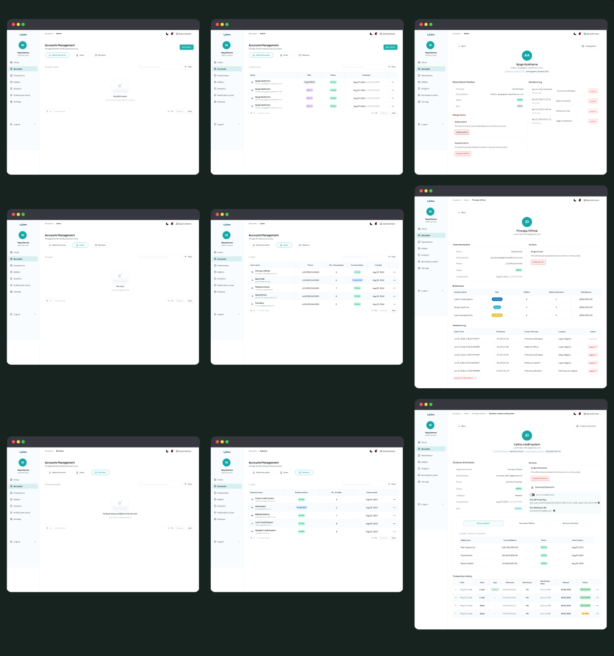
Structure account management around distinct roles
I designed Accounts Management around three distinct entities: Admin Accounts, Users, and Businesses, giving each its own dedicated view while keeping the relationships between them visible. Admins can manage internal staff accounts and their roles, while the Users view provides a broader picture of customers and the businesses associated with them. The Business view then shifts the focus to the organisation itself, including its status, wallets, members, balances, and transaction activity. Rather than treating these as separate datasets, I designed the experience so admins can move from user → business → wallets → transactions and quickly understand the context behind an account.
Final experience
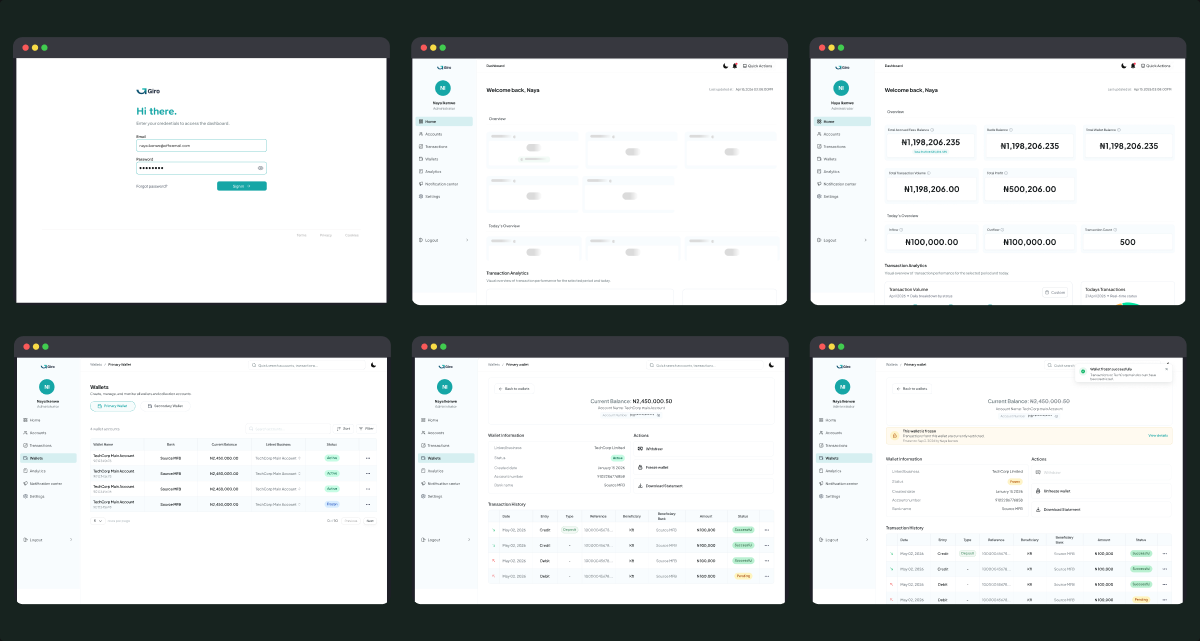
The final experience brings Girostack's core operational workflows into one connected workspace. Admins can move from a high-level platform overview into businesses, wallets, transactions, analytics, reports and configuration without losing context.
The interface is structured around a simple operational flow:
Monitor → Find → Understand → Act
This allows the portal to support both everyday administration and deeper investigation when something requires attention.
Design system
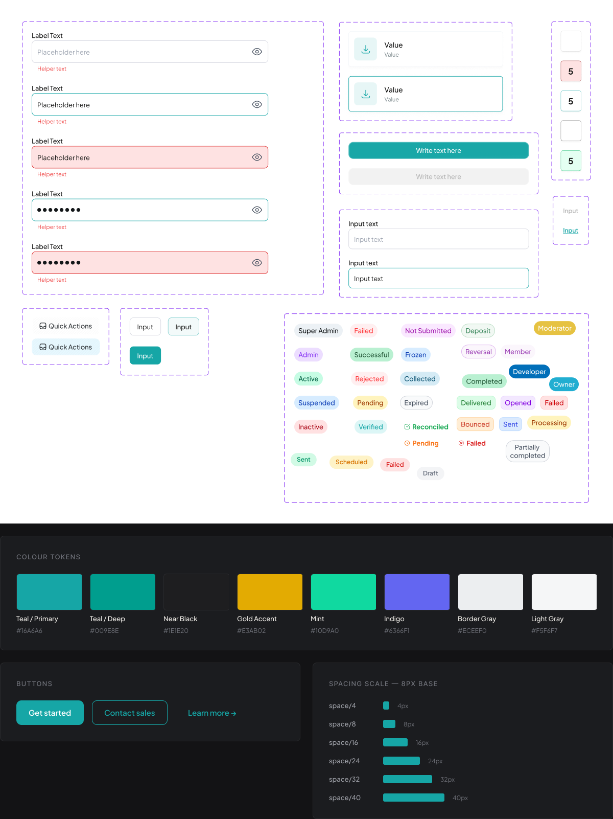
Because the portal contains multiple complex workflows, I established reusable patterns rather than designing every screen independently. The system covers typography, colour, buttons, inputs, tables, cards, filters, status indicators, charts, modals, alerts, empty states, loading states and confirmation patterns.
The goal was to create one visual and interaction language across the entire portal, while allowing individual workflows to remain flexible.
NEXT PROJECT
Direct debit dashboard →