Fintech · API Infrastructure · B2B SaaS · Product Design
Direct Debit Platform
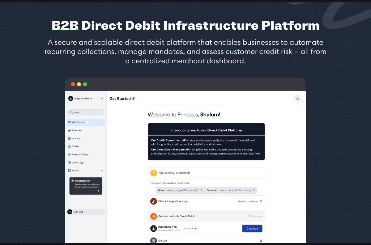
Designing the operational layer for financial infrastructure, helping lending businesses integrate, monitor and manage credit assessment and direct debit from one platform.
- Role
- Product Designer
- Timeline
- 4 Weeks
- Platform
- Web
- Team
- Cross-functional Product team
- Industry
- Fintech · Payment Infrastructure
Overview
The Direct Debit Platform is an API product built for lending businesses that need to assess borrowers and automate loan repayment.
It brings two capabilities together: Credit Assessment, which analyses borrower financial data and provides credit insights, and Direct Debit, which manages digital consent and automated repayment collection. Businesses can use either product independently or combine both into an end-to-end lending workflow.
My role was to translate this technically complex infrastructure into a business-facing dashboard where users could onboard, integrate, monitor usage, manage funds, understand billing, troubleshoot API issues and securely configure their account.
The goal wasn't to hide the complexity of the product, but to organise it around the jobs users actually need to accomplish.
The problem
Financial infrastructure products often have a gap between what the API can do and what the people operating the business need to understand.
A developer may care about endpoints, API keys, response codes and webhooks.
A finance or operations team may care about wallet balance, usage, failed collections, mandates and billing.
A business owner may simply want to know:
Is everything working? How much am I spending? What needs my attention?
The challenge was designing one experience that could support these different mental models without turning the dashboard into a collection of disconnected technical tools.
I therefore approached the product around four core needs:
Get started → Understand → Operate → Troubleshoot
The Solution
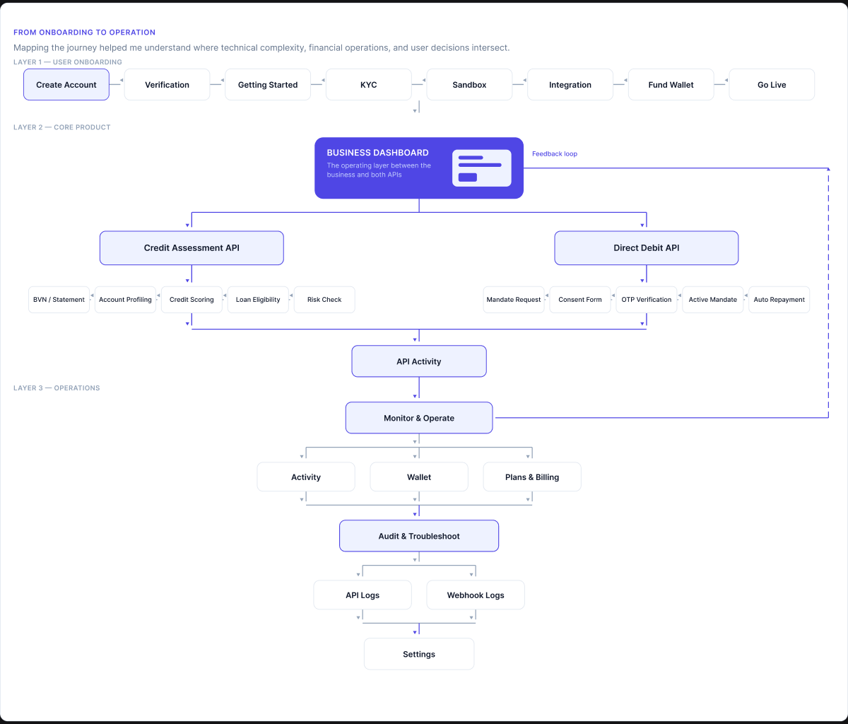
Before designing individual screens, I mapped the business journey around the lifecycle of using the platform:
Create account → Verify → Get credentials → Integrate → Test → Fund wallet → Monitor usage → Manage transactions → Go live
Key product decisions
01
Login Screen
Designing the entry point around trust, not friction
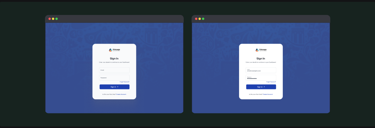
For a fintech infrastructure product, authentication is more than a gateway into the dashboard.
The login experience therefore needed to feel secure, familiar and lightweight.
I kept the interaction focused on the essentials:
- Password
- Remember me
- Password recovery
- Clear primary login action
Rather than introducing unnecessary steps at login, I kept authentication simple and moved more complex verification requirements into the appropriate parts of onboarding and account setup.
The thinking
A common mistake in fintech products is making the entry experience feel heavier than necessary in the name of security.
My approach was to separate authentication from onboarding.
02
Create Account
Reducing onboarding friction without compromising business verification
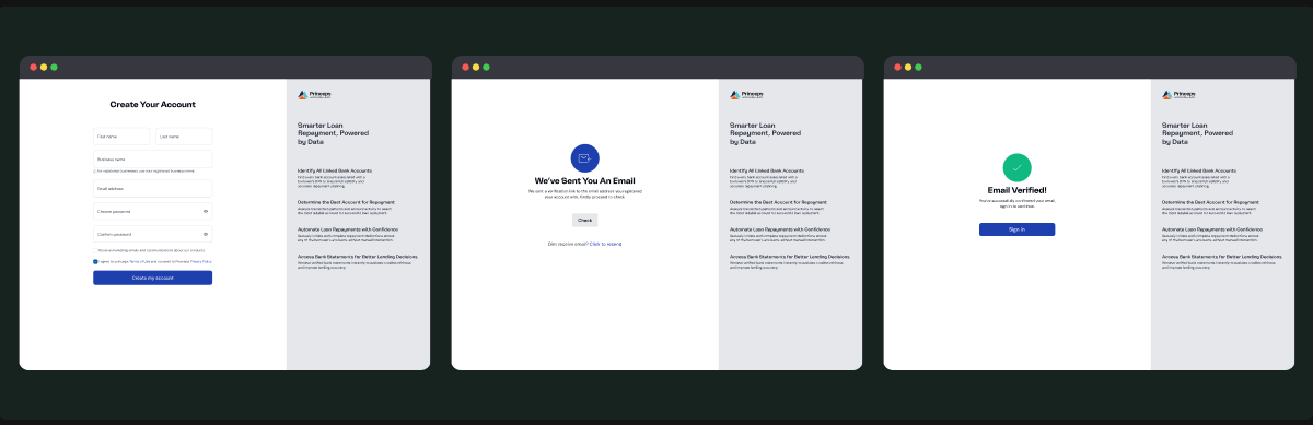
Creating an account required more than collecting a user's email and password. The platform is built for businesses, so the account needs enough information to establish the business relationship.
Email verification then activates the account before the user proceeds to the dashboard.
The thinking
I intentionally separated account creation from KYC.
Instead of asking a new user to complete a long business verification form before they can even explore the platform, the experience gets them into the product first and then guides them through the requirements needed to go live.
This creates a more progressive onboarding model:
Create account → Explore sandbox → Complete KYC → Test integration → Fund wallet → Go live
Problem solved
This addresses one of the biggest friction points in infrastructure products: asking users to understand and complete everything before they have experienced the product's value.
Instead, the platform gives users a reason to continue.
03
Dashboard
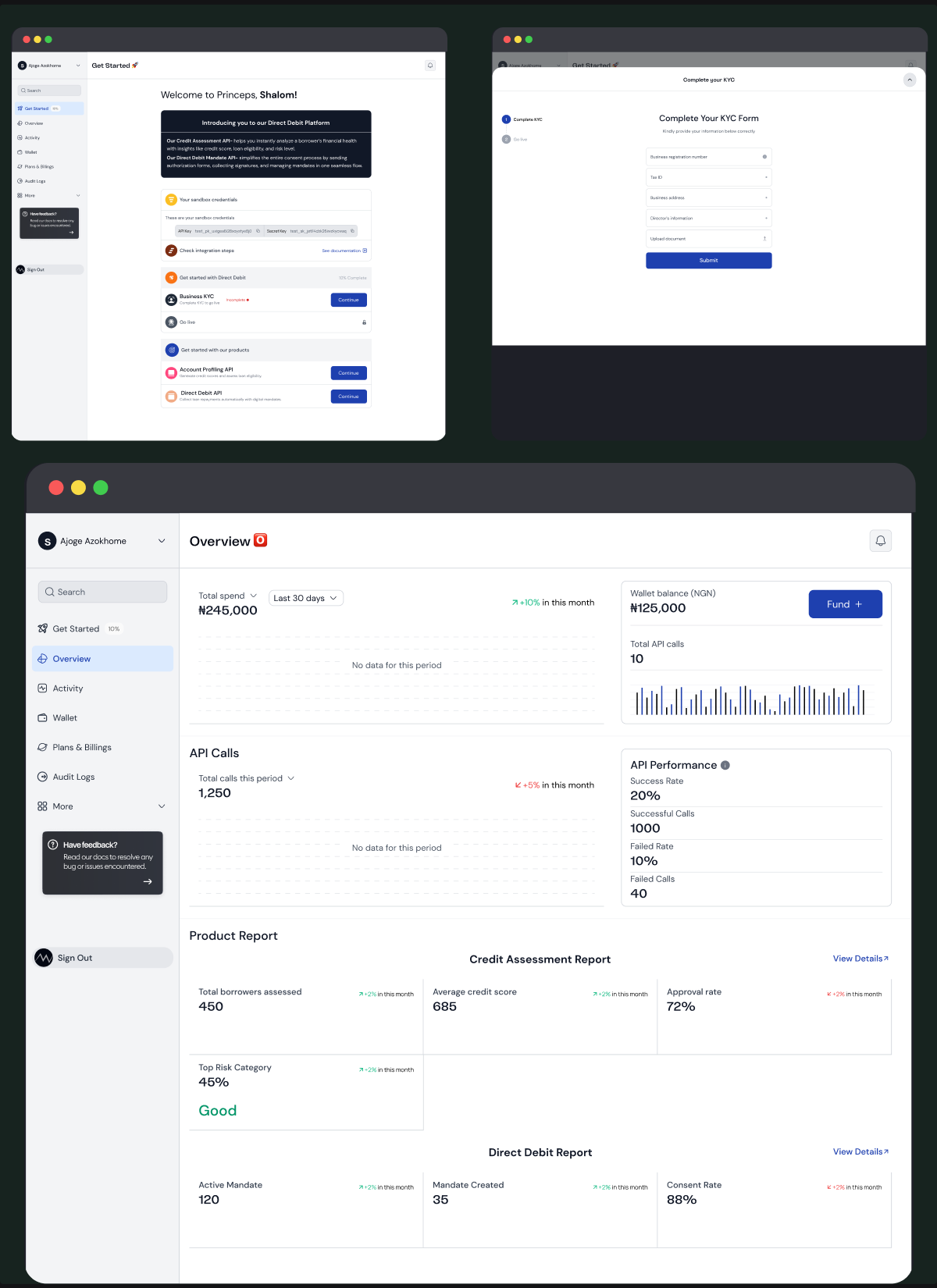
Turning technical infrastructure into an operational overview
The dashboard became the central place for answering: “How is my integration performing right now?”
Rather than filling the first screen with every available metric, I structured the experience around the signals that matter most:
- Total spend
- API calls
- API performance
- Wallet balance
- Usage trends
- Spending breakdown
- Product-level reports
The thinking
I treated the dashboard as a decision-making surface, not a data dump.
For example, a wallet balance isn't useful in isolation.
The user needs to understand: Balance → Usage → Potential depletion → Action
That's why wallet health and funding actions are surfaced alongside usage information.
Similarly, API performance isn't just a percentage. A failed-call metric should lead somewhere useful, into error breakdowns and ultimately into the relevant activity or API logs.
Problem solved
Many infrastructure dashboards expose metrics without connecting them to actions.
My approach was:
Every important metric should either provide context or provide a path to action.
04
Activity
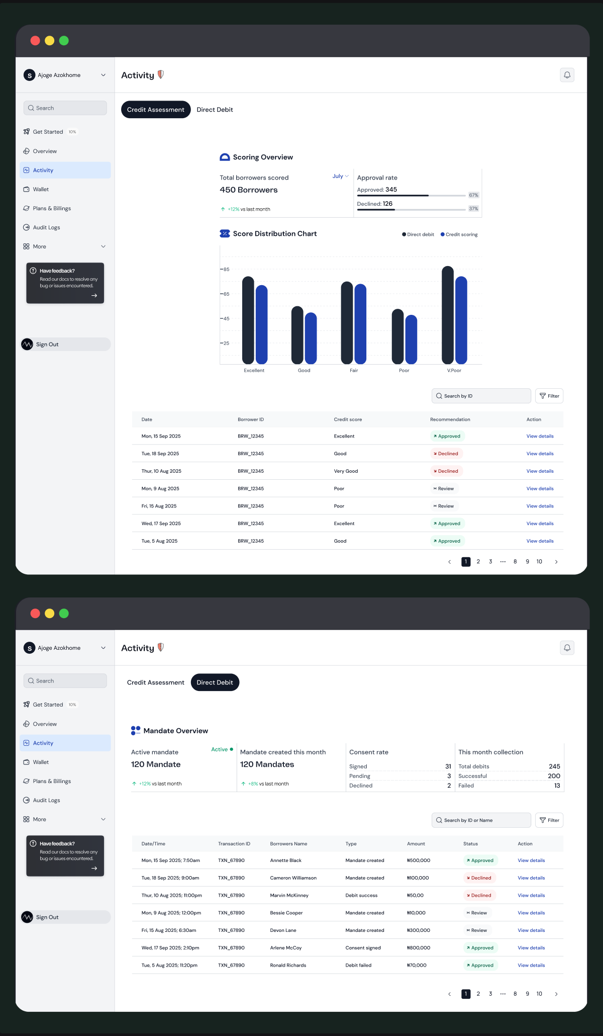
Bringing two very different products into one activity model
The platform has two distinct products:
Credit Assessment and Direct Debit
Their operational data is fundamentally different.
Credit Assessment users need to understand scores, risk categories, recommendations and borrower assessments.
Direct Debit users need to understand mandates, consent, debits, collections and failures.
Rather than creating completely separate experiences, I introduced a shared Activity area with product-specific tabs.
The thinking
The important design decision wasn't simply “use tabs.”
It was creating a consistent operational pattern across both products:
Summary → Data → Filters → Details → Action
Problem solved
Financial operations rarely stop at seeing that something failed.
The real question is: Why did it fail, and what can I do about it?
Designing details and actions together reduces the distance between diagnosis and resolution.
05
Plans & Billing
Making API costs understandable
Usage-based fintech products can become difficult to understand when multiple services have different pricing models.
A business might be paying for:
- Credit assessments
- Direct debit mandates
- Direct debit transactions
- Statement generation
- Notifications
- Subscription plans
The thinking
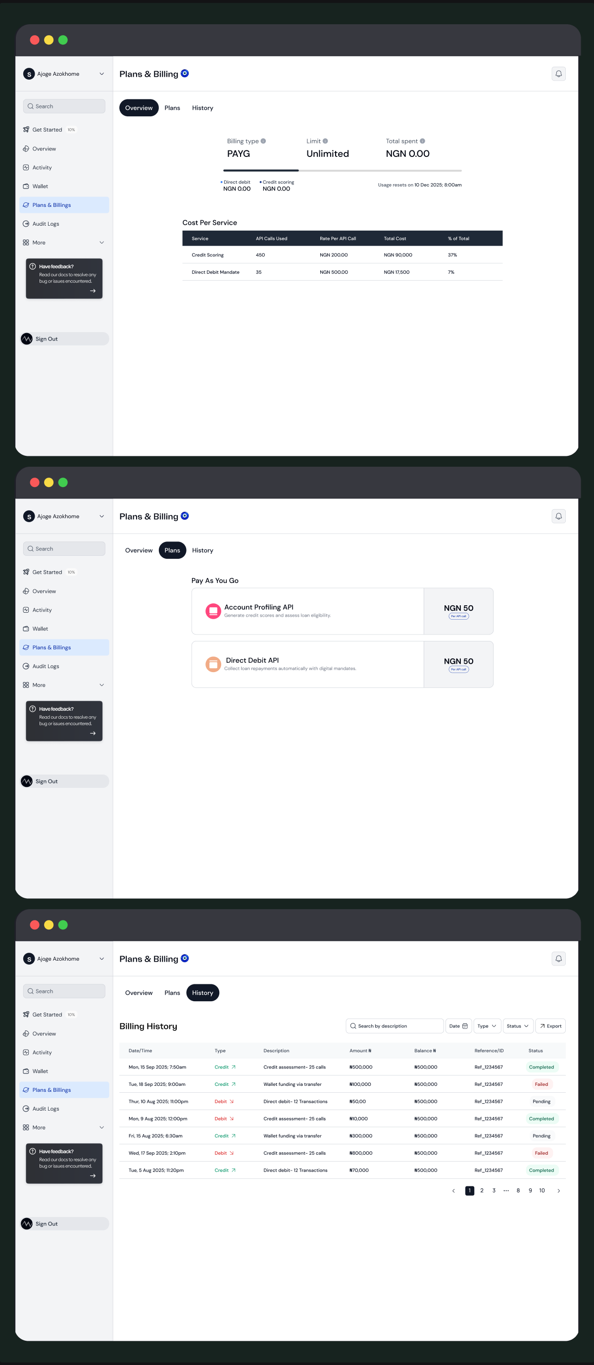
I designed billing around explainability.
Instead of showing only: “You spent ₦219,800”
the experience should help answer: “What did I spend it on?”
That led to a structure of:
Total usage → Service breakdown → Cost → Billing history → Transaction details
Billing history also supports filtering, searching, exporting and viewing detailed transaction information.
Problem solved
A common weakness in usage-based products is the gap between being charged and understanding the charge.
My design closes that gap by connecting the bill back to the underlying service activity.
That makes billing useful for both financial reconciliation and product monitoring.
What I solved differently
01. From dashboard metrics to decisions
I didn't treat metrics as the end of an interaction.
Where possible, metrics lead users toward context, drill-downs or actions.
02. From technical complexity to progressive disclosure
API keys, error codes, webhook payloads and transaction data can overwhelm non-technical users.
Instead of removing technical information, I structured it so users encounter complexity when they need it.
03. From failure states to recovery paths
A failed debit isn't just a red badge.
A failed API request isn't just a 400.
The experience provides the information needed to understand the failure and, where possible, recover from it.
04. From billing transparency to billing intelligence
Rather than showing users what they were charged, the product helps them understand what generated the charge.
That makes billing useful for reconciliation and usage management.
05. From onboarding checklist to activation journey
The Getting Started experience turns a potentially intimidating API integration into a sequence of achievable steps.
The platform exposes sandbox credentials, documentation, KYC, products and go-live requirements in the context of the user's progression.
06. From logs as records to logs as investigation tools
Audit Logs connect technical events to explanations and actions, making troubleshooting part of the product rather than something users have to leave the platform to figure out.
NEXT PROJECT
HelthNic mobile app →