Healthcare · Mobile App · Self-Initiated Practice · Product Design
HelthNic Mobile App
Exploring how a more focused digital experience could make finding and booking healthcare feel more personal and predictable.
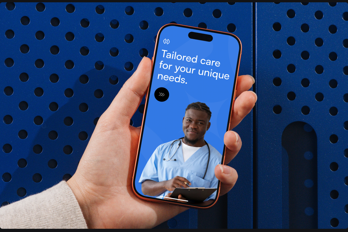
- Role
- Product Designer
- Platform
- Corporate mobile app
- Industry
- Med Health
The problem
Finding the right healthcare professional can involve several disconnected decisions.
A patient needs to identify the right specialist, understand whether the professional is suitable, check their experience and ratings, find an available appointment time, and ultimately commit to a booking.
In many digital healthcare experiences, these steps can feel disconnected, users discover a provider in one place, search for availability somewhere else, or have limited context before making an appointment.
For this self-initiated project, I explored:
How might I bring provider discovery, trust, availability, and appointment booking into one focused mobile experience?
The objective wasn't to solve every healthcare problem, but to explore how thoughtful product structure could reduce friction around finding and booking care.
Thinking
Because this was a practice project rather than a commissioned product, I started from a hypothetical user need instead of an existing business brief.
I mapped the core patient journey as:
Discover → Evaluate → Check availability → Select time → Book
This immediately highlighted four things the experience needed to communicate:
Who is this doctor?
Can I trust them?
When can I see them?
How do I book?
Rather than introducing unnecessary functionality, I focused the concept around those decisions.
The Business
Although HealthNic was not a real client project, I approached the exercise from a product perspective.
The hypothetical business objective was to create a healthcare marketplace that could help patients discover qualified professionals while making appointment booking straightforward.
That creates an important balance:
For the patient: provide enough information to make a confident healthcare decision.
For the platform: make discovery and booking simple enough that users can successfully move from browsing to appointment.
This influenced the decision to combine provider credibility, pricing, ratings, availability, and booking within the same journey.
The Users
For the concept, I focused on a patient who is comfortable using mobile applications but doesn't necessarily want to navigate a complicated healthcare platform.
The user is primarily trying to:
- Find the appropriate specialist
- Compare available doctors
- Understand experience and ratings
- See appointment pricing
- Find a convenient time
- Complete the booking without unnecessary steps
The key insight I designed around was:
Patients aren't only searching for a doctor. They're looking for enough confidence to choose one.
This is why the doctor profile isn't treated as a simple directory listing.
Key product decisions
01
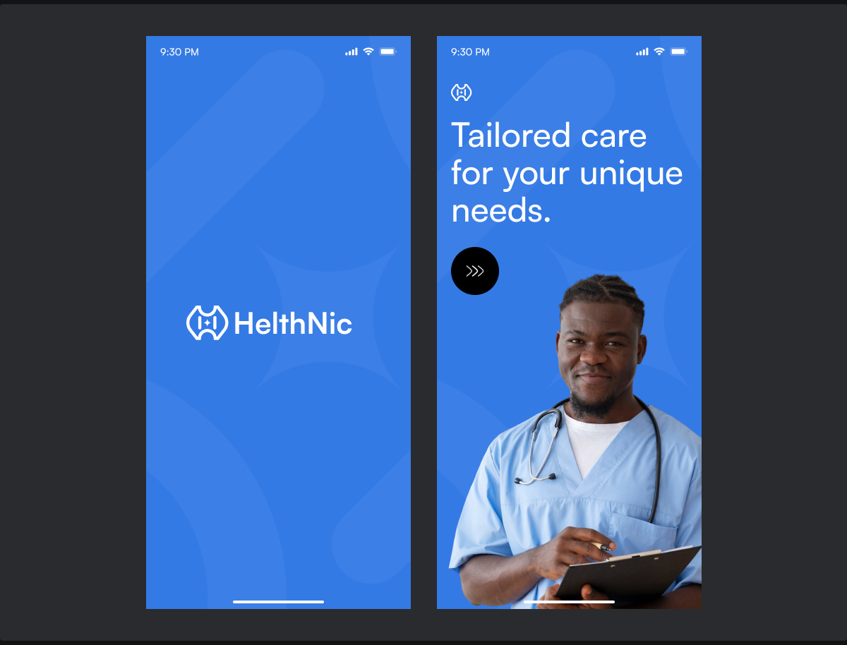
Make onboarding communicate the product's value
The opening experience immediately communicates:
“Tailored care for your unique needs.”
Rather than starting with a long explanation of features, the onboarding uses a simple value proposition and visual representation of a healthcare professional.
My thinking
The first interaction should establish what the product is for before asking users to navigate it.
I kept the onboarding lightweight because the primary value of HealthNic is better experienced through the actual discovery and booking journey.
02
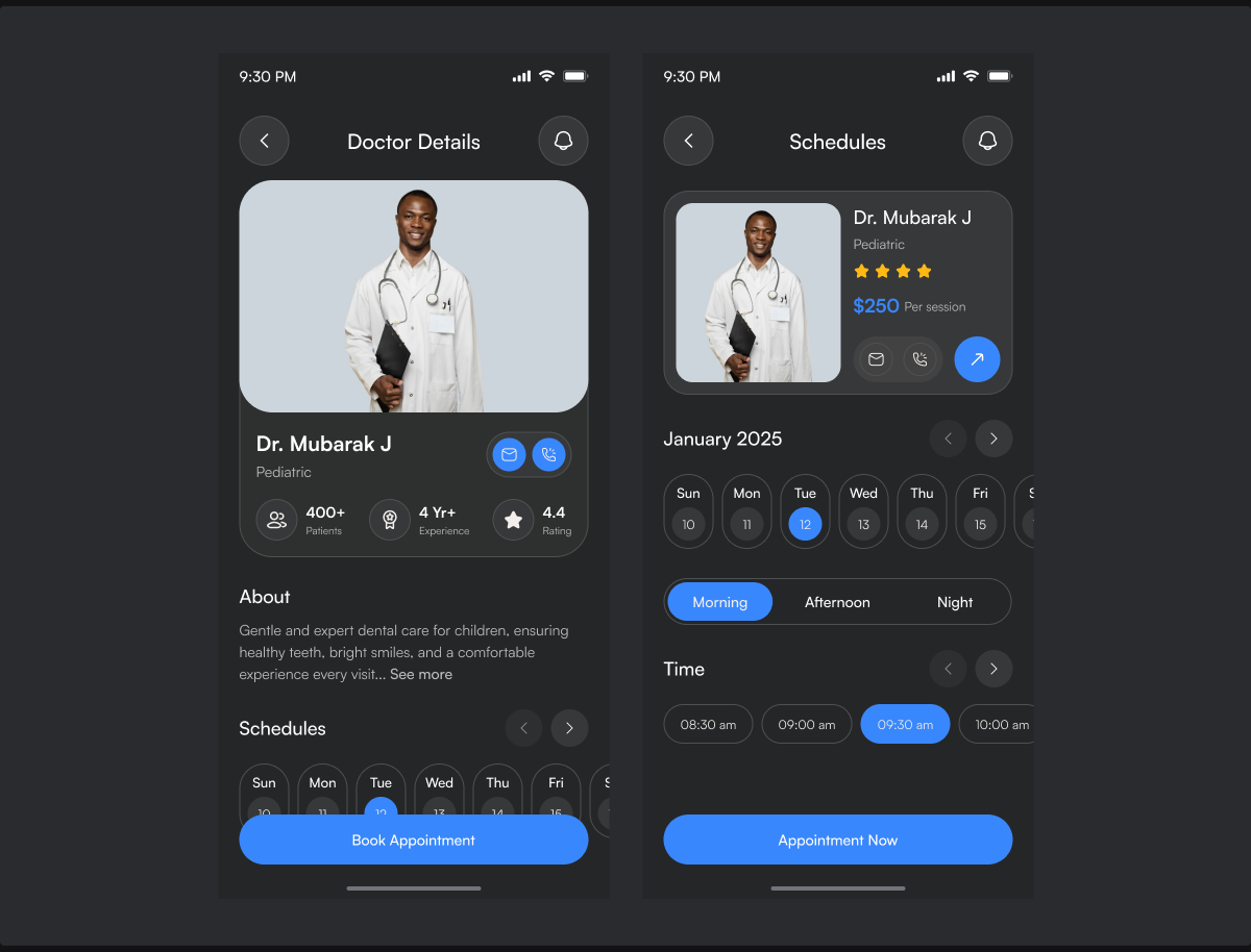
Make availability part of provider discovery
I brought appointment availability directly into the doctor experience rather than treating scheduling as a completely separate task.
Users can navigate dates, choose a time period such as Morning, Afternoon, or Night, and select an available appointment time.
My thinking
A doctor may be highly rated and perfectly suited to the patient, but if they aren't available when the patient needs care, they're not necessarily the right choice.
So I treated:
Doctor suitability + availability as connected decisions.
This reduces the back-and-forth that often happens when users have to find a provider first and only discover availability much later.
03
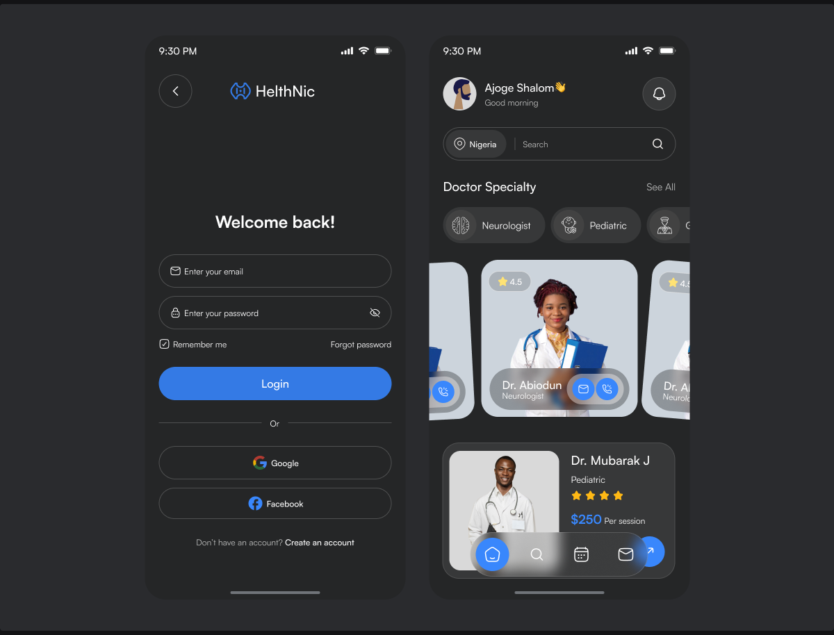
Make discovery feel personal
The home screen introduces:
- Location
- Search
- Doctor specialties
- Recommended doctors
- Ratings
- Pricing
- Quick actions
The experience is designed to help users move from a broad search toward a relevant provider.
My thinking
Rather than presenting an undifferentiated list of doctors, I explored a more guided discovery model:
Where are you? → What kind of care do you need? → Which doctor fits?
This creates a more natural starting point for healthcare discovery.
Final experience
The final concept connects the patient journey into one continuous flow:
Onboarding → Discover a doctor → Evaluate provider → View availability → Select appointment → Book
The main design principle was to keep the information required to make a decision close to the action that follows it.
A patient shouldn't have to remember a doctor's rating while checking availability, or leave the provider profile to find appointment times.
The experience therefore brings trust, context, availability, and action together.
The Constraints
Because HealthNic was a self-initiated practice project, there were no real engineering constraints, stakeholder requirements, regulatory approvals, or production limitations to work within.
Instead, I deliberately imposed a product-design constraint on myself:
How much useful information can I give a patient without turning provider discovery into an overwhelming experience?
That led me to prioritise the information most relevant to the booking decision, specialty, experience, rating, pricing, provider information, and availability, while keeping secondary details progressively disclosed.
I also designed the concept as a mobile-first experience, which required careful prioritisation of content within a limited viewport.
Outcome
HealthNic was not launched as a production product, so there are no real-world conversion, booking, retention, or usability metrics to report.
The outcome of the exercise was instead the design of a complete healthcare discovery and booking concept that allowed me to practise:
- Designing for a high-consideration decision
- Structuring provider information
- Creating a discovery-to-booking journey
- Designing appointment scheduling
- Establishing trust through information hierarchy
- Designing mobile-first interfaces
- Connecting multiple screens into one coherent product experience
More importantly, the project helped me practise approaching a healthcare product as a system of decisions rather than a collection of screens.
NEXT PROJECT
Prime Vault Mobile App →