Fintech · B2B SaaS · Product Design
Girostack Landing Page
View Site View Site
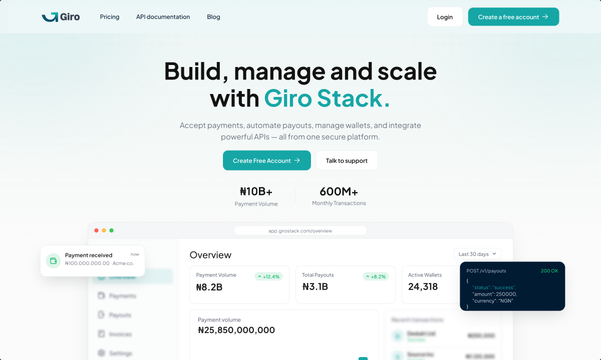
Reframing a complex payment infrastructure platform into a clear, credible and conversion-focused digital experience.
- Role
- Product Designer
- Timeline
- 1 Week
- Platform
- Responsive web
- Team
- Cross-functional Product team
- Industry
- Fintech · Payment Infrastructure
Overview
Girostack is a B2B payment gateway platform, comparable to Monnify and Flutterwave, serving businesses that need to move money reliably across payins, payouts and disbursements. I worked within the existing product design system to extend and refine the admin back office and public-facing marketing site.
The problem
Girostack offers a technically complex product, but the website needed to communicate that value without making visitors understand the infrastructure behind it first.
The challenge was to create an experience that could quickly answer three questions:
What is Girostack? Why should I trust it? And why should I choose it?
The existing experience also needed stronger hierarchy across product messaging, pricing, capabilities and trust signals so users could understand the platform without working through dense information.
My role
I led the landing page redesign from content hierarchy and information architecture through visual exploration and high-fidelity execution.
My work included restructuring the page narrative, refining product messaging, designing key sections and interactions, and ensuring the experience remained consistent with Girostack's broader product ecosystem.
I worked closely with stakeholders to balance business positioning, product accuracy and user clarity throughout the process.
The Solution
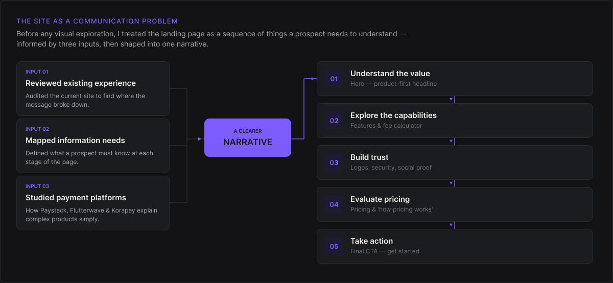
Rather than starting with visual exploration, I first looked at the website as a communication problem.
I reviewed the existing experience, mapped the information users needed at each stage of the page, and studied how established payment platforms communicate technically complex products without overwhelming prospective customers.
This helped establish a simpler narrative:
Understand the value → Explore the capabilities → Build trust → Evaluate pricing → Take action.
Key product decisions
01
Led with the outcome, not the infrastructure
Instead of opening with technical payment terminology, I positioned Girostack around what businesses ultimately want to achieve, build, manage and scale their payment operations reliably.
The supporting content could then progressively explain the infrastructure behind that promise without overwhelming first-time visitors.
02
Designed the page around progressive disclosure
Not every visitor needs every piece of information immediately.
I structured the experience so the most important value propositions appear first, while product capabilities, pricing, security and supporting information become more detailed as users move deeper into the page.
This created a clearer reading experience while still serving more technical decision-makers.
03
Made pricing and trust part of the product story
For a financial product, credibility cannot be treated as footer content.
Pricing clarity, security standards, infrastructure reliability and compliance signals were deliberately integrated into the experience to reduce uncertainty and make Girostack feel like a platform businesses could confidently build on.
Before vs After
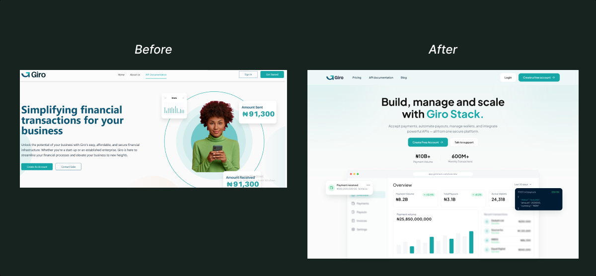
Before
The original landing page had a weaker visual hierarchy, inconsistent spacing, and unclear content structure. The messaging and UI competed for attention, making the experience feel less polished and harder to navigate.
After
I redesigned the landing page with a cleaner layout, stronger typography, clearer hierarchy, and more intentional use of product visuals. The new experience feels more modern, credible, and easier to understand at a glance.
A shift from a cluttered interface to a clearer, more polished product experience.
Final experience
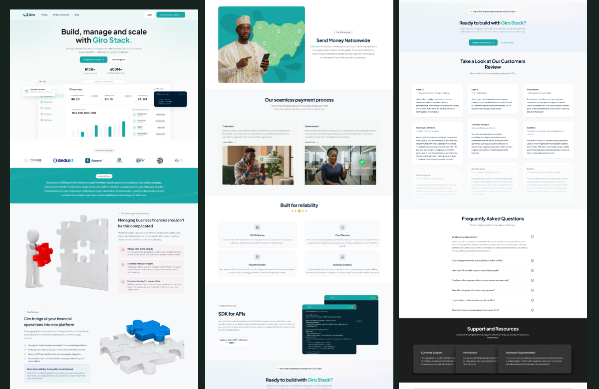
The final direction combines clear messaging, strong visual hierarchy and focused calls to action to create an experience that feels both technically credible and approachable.
Each section has a specific role in moving visitors from understanding Girostack's value to confidently exploring its products and taking action.
Design system
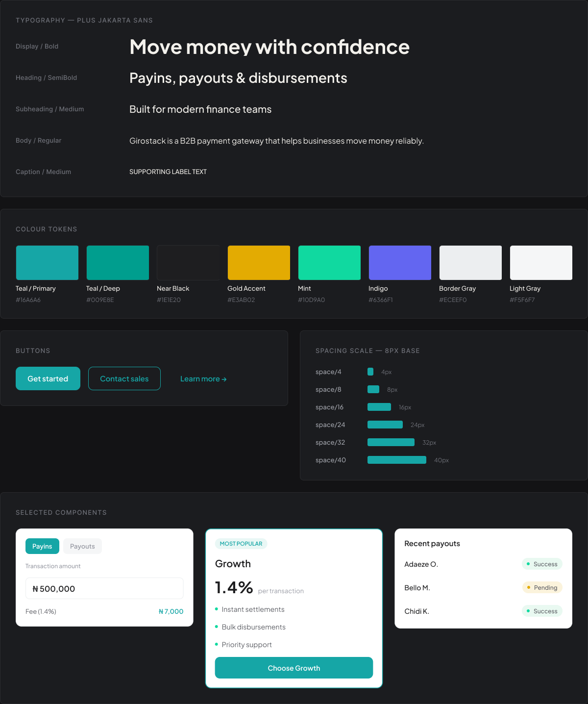
The landing page was built using a reusable visual system rather than treating each section as an isolated composition. Typography, spacing, buttons, cards, layouts, colour usage and responsive behaviour were structured around consistent rules, making the website easier to extend as Girostack's product offering evolves. Visual for this section: Typography, colours, buttons, cards, spacing tokens and selected website components.
Impact
Consistent
Fee logic across all rails
1 pattern
For every irreversible action
0 drift
Between light and dark themes
Learnings
This project reinforced that designing for a technical product is often less about adding information and more about deciding what users need to understand first.
The strongest improvement did not come from making the interface more visually complex; it came from simplifying the story, creating intentional hierarchy and ensuring every section answered a meaningful user or business question.
It also strengthened my understanding of the relationship between content design, product positioning and interface design, particularly in fintech, where clarity directly influences trust.
NEXT PROJECT
RouteX →