Mobility · Transportation · Product Design
RoutexGo Mobile App
Download on Play StoreDesigning a simpler and more predictable way for commuters to discover, book and manage everyday city trips.
- Role
- Product Designer
- Timeline
- 3 Weeks
- Platform
- Mobile App · Driver PWA
- Team
- Cross-functional Product team
- Industry
- Mobility · Transportation
Overview
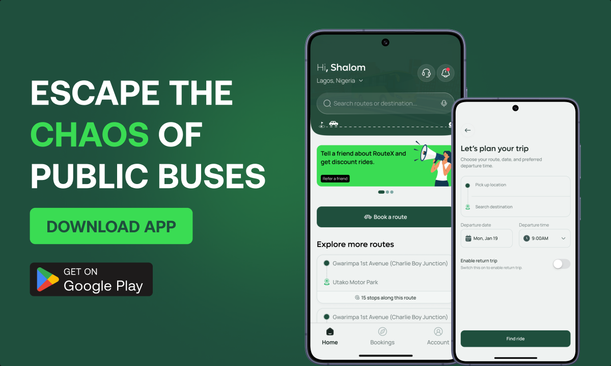
RouteX is a city mobility platform designed to make everyday commuting more convenient, predictable and accessible.
The product helps passengers discover available routes, book trips and manage their journeys, while providing drivers with the tools required to view assigned routes, manage passenger manifests and complete trips efficiently.
My focus was to create an experience that reduced the uncertainty typically associated with daily commuting and made moving around the city feel significantly more structured.
The problem
Daily commuting can involve a lot of uncertainty.
Passengers often have to figure out which route to take, where to board, whether transportation is available and what alternatives exist when their preferred route isn't supported.
For RouteX, the challenge wasn't simply designing a booking interface.
It was designing an experience that could make users feel confident about the entire journey, from finding the right route to arriving at their destination.
My role
I worked across the core RouteX experience, translating product requirements into intuitive passenger and driver workflows.
My responsibilities included information architecture, user flows, interaction design, high-fidelity UI, product copy and the design of key journeys such as route discovery, trip booking, route suggestions, seat selection, safety interactions and driver trip management.
Throughout the process, I focused on balancing operational requirements with a passenger experience that remained simple and approachable.
The Solution
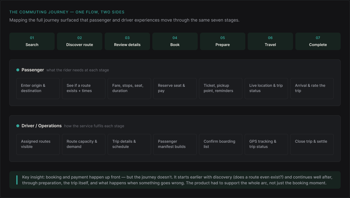
I started by looking beyond the booking screen and mapping the complete commuting journey.
A passenger's experience begins before payment and continues long after a seat has been reserved. They need to know where they're going, whether a suitable route exists, what happens next and what options are available when something goes wrong.
That led to a clearer product journey:
Search → Discover a route → Review trip details → Book → Prepare for the trip → Travel → Complete journey.
I also considered the operational side of the service, ensuring the driver experience supported the same journey through assigned routes, passenger manifests, trip status and GPS tracking.
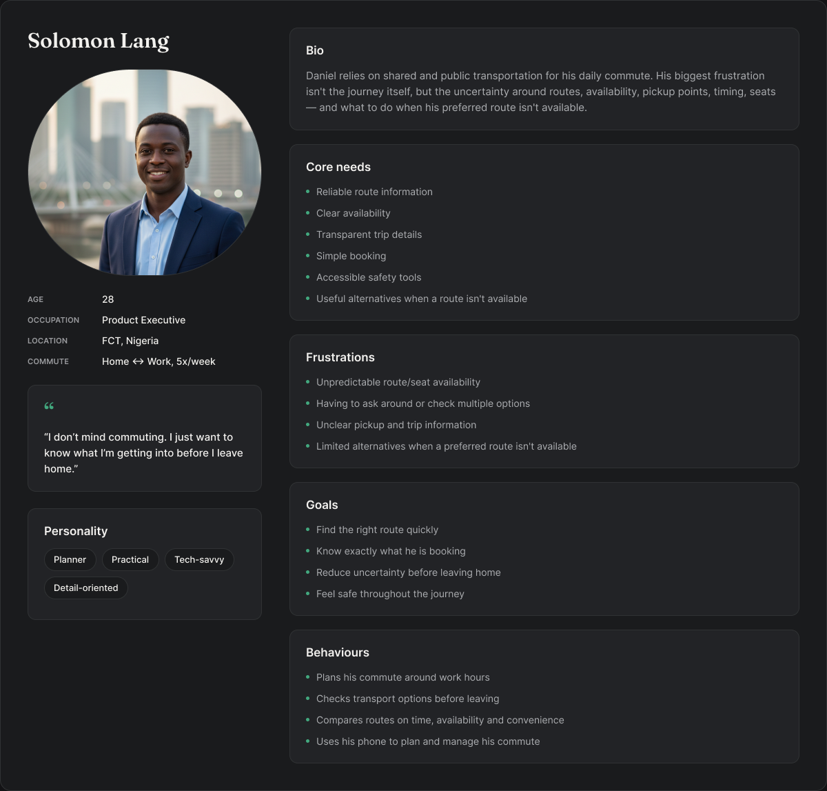
User Persona
I built this persona to ground every product decision in the real needs, frustrations and behaviours of everyday commuters, not assumptions.
Key product decisions
01
Designed route discovery around user intent
Users shouldn't need to understand the transport network before using the product.
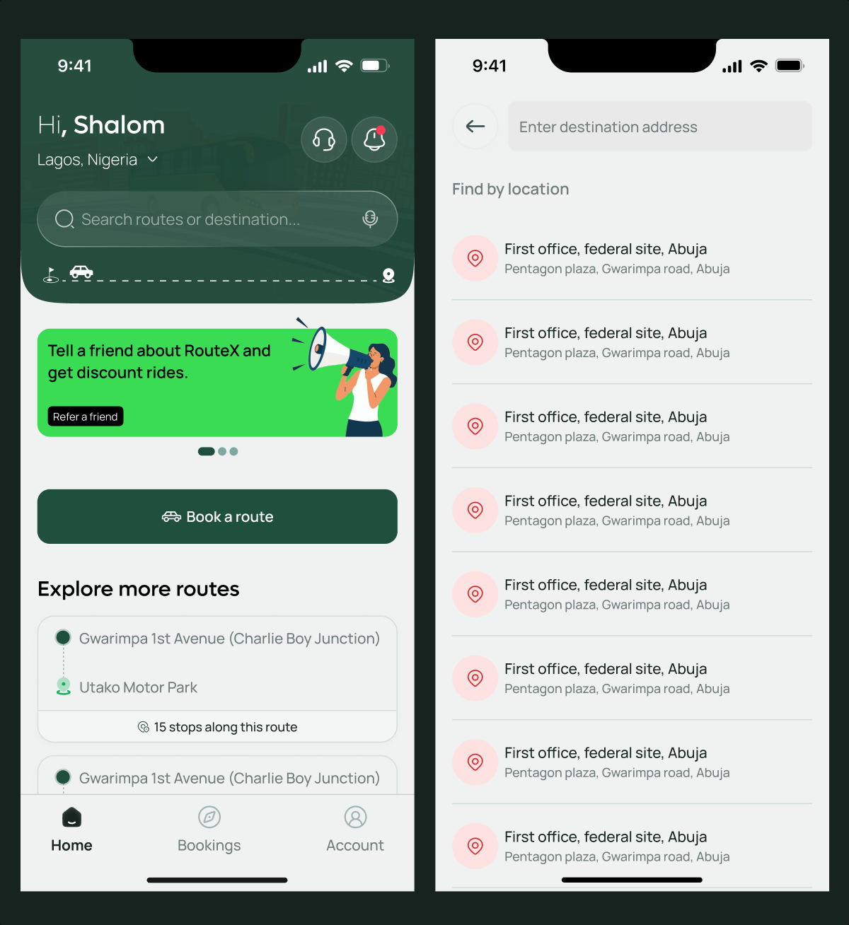
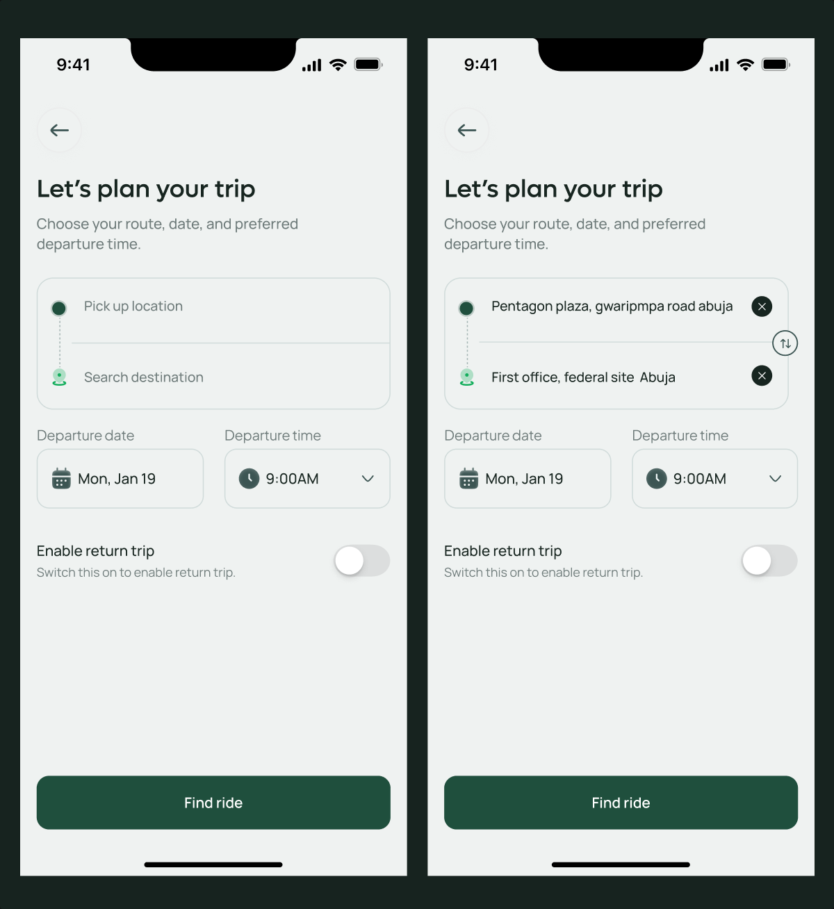
The primary experience starts with a simple question: Where are you travelling from and where are you going?
RouteX uses those inputs to surface relevant routes and trip information, reducing the cognitive effort required to navigate an unfamiliar transport system.
02
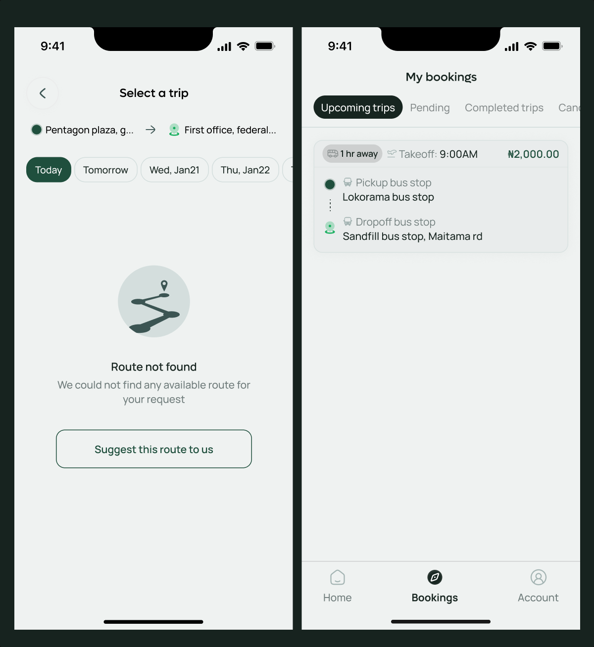
Turned unavailable routes into product insight
An unavailable route doesn't have to become a dead end.
I designed Suggest this route, allowing passengers to express demand when the route they need isn't currently available.
This gives users a meaningful next step while also creating a potential feedback loop for RouteX to understand where future route expansion may be valuable.
03
Designed safety as part of the journey
Safety shouldn't feel like an isolated feature users have to search for during an emergency.
I introduced accessible safety interactions, including a panic action, within the travel experience so passengers could quickly reach support when needed.
The goal was to make safety feel like an inherent part of the service rather than an additional feature layered onto it.
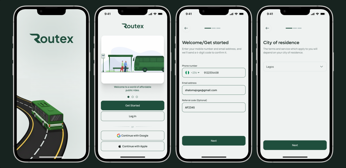
The Onboarding
RouteX onboarding was designed to communicate the value of the product before asking users to take action.
Rather than explaining every feature, I focused the experience around the three things commuters care about most, finding the right route, booking with confidence, and having a more predictable journey.
The screens use concise messaging, clear visuals and a short progression so users can quickly understand what RouteX does without turning onboarding into another task they have to complete.
Final experience
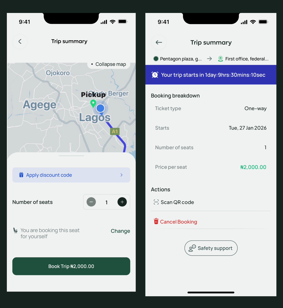
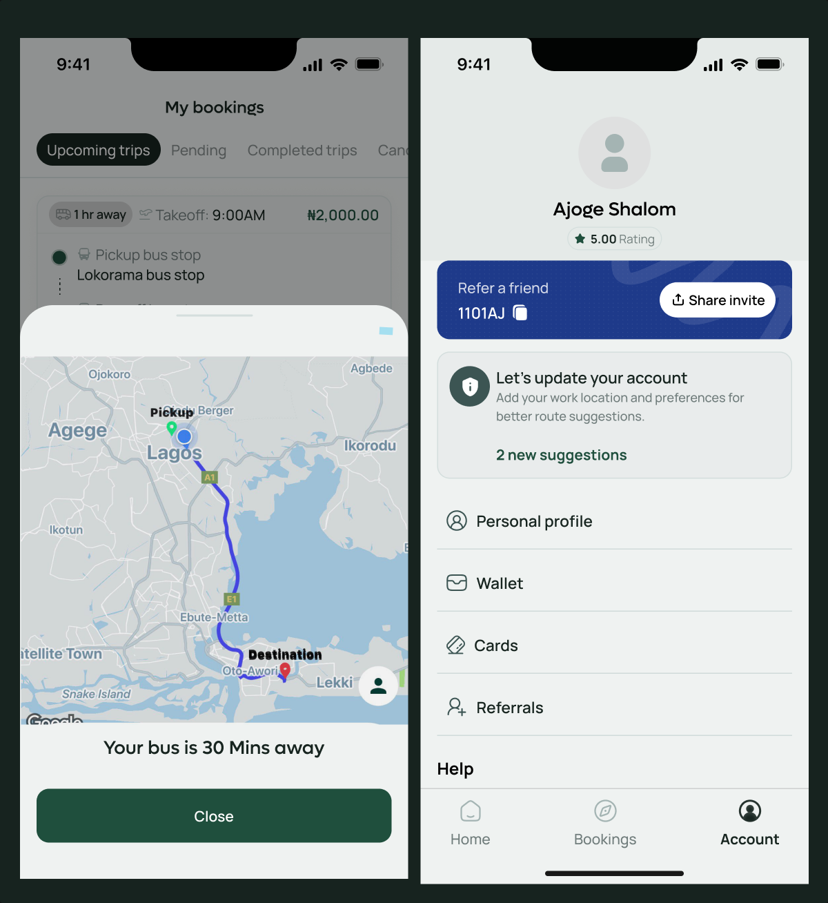
The final RouteX experience brings the essential parts of urban commuting into one coherent flow.
Passengers can search for journeys, explore routes, reserve seats, manage bookings and access important trip information without navigating unnecessary complexity.
At the same time, the driver PWA provides a focused operational experience for viewing assigned trips, confirming passenger manifests, starting journeys, maintaining GPS tracking and completing trips.
Together, both sides create a more connected transportation experience.
Design system
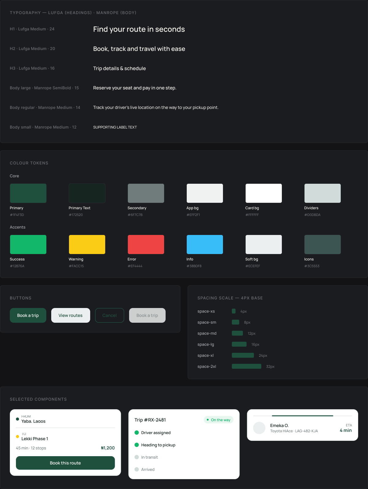
RouteX was built on a reusable visual system rather than treating each screen as an isolated composition. Typography, spacing, buttons, cards, colour usage and responsive behaviour were structured around consistent rules, making the product easier to extend as the service grows across new routes and cities.
Impact
- Consistent
- Fee logic across all rails
- 1 pattern
- For every irreversible action
- 0 drift
- Between light and dark themes
Learnings
RouteX reinforced that mobility design is ultimately about reducing uncertainty. Users aren't only booking a seat; they're trusting a service to get them somewhere safely, reliably and with as little friction as possible.
The project pushed me to think beyond individual screens and consider how passengers, drivers, routes, safety and operational processes work together as a complete service.
It also reinforced an important product principle for me: a good experience shouldn't end when the system can't fulfil a user's request. Sometimes the better solution is creating a meaningful next step, which became the thinking behind “Suggest this route.”
NEXT PROJECT
NWO Fashion →